james island
1930s Lowcountry Colonial
When Lauren Fogelgren landed an unexpected job opportunity in Charleston, South Carolina, she and her husband jumped at the chance to move from Atlanta to the coast. “We've always been drawn to Charleston and wanted to be near the water but also felt like it would be a great place for our then 2-year-old child to grow up,” says Fogelgren. After seeing this classic Colonial-style house in a quiet pocket of James Island, just a street over from rows of live oaks, the couple knew it was the one. "It felt like a family home,” says Fogelgren. “I immediately loved how it had formal rooms but all of the spaces still felt connected. It was warm and welcoming.” They also knew it needed a lot of TLC, especially when it came to updating the tight kitchen and baths.
“This is the third home we’ve lived in that was built in 1930, so I guess we have a thing for old houses,” says Fogelgren.
Choosing a designer to tackle the renovation was easy. Before the move, they had been working with Laura Jenkins to reimagine their Atlanta bungalow. Halting progress there, the pair brought the Georgia designer along for the Lowcountry turnaround. “This is the third home we’ve lived in that was built in 1930, so I guess we have a thing for old houses,” says Fogelgren.
“Since it’s a very black-and-white house, we wanted to brighten it and add some cheer.”
The trio began inside, tweaking the floor plan and reconfiguring the furniture layout to make the most of the three-bedroom home’s 2,322 square feet. Outside, they leaned into the facade’s traditional style, framing the entry with wisteria and splashing the front door with Farrow & Ball’s Setting Plaster (No. 231). “Walking through downtown Charleston, there is so much inspiration and color,” explains Fogelgren. “Since it’s a very black-and-white house, we wanted to brighten it and add some cheer.” Here’s how the young couple, with Jenkins as their guide, infused the historic home with a comfortable, English-influenced blend of old and new.
“These are mostly Charleston artists," says Fogelgren. “I’ve found a lot of vintage artwork and local pieces over the past few years.”
“The simple, muted palette of the home allows all the added layers to shine,” says Jenkins of the entry, where the warmth of the original hardwood floors is balanced with a coat of Farrow &Ball’s French Gray (No. 18) on the trim and Benjamin Moore’s Simply White (OC-117) on the walls. Up the staircase, an ever-changing gallery wall introduces color and character. “These are mostly Charleston artists,” says Fogelgren. “I’ve found a lot of vintage artwork and local pieces over the past few years.”
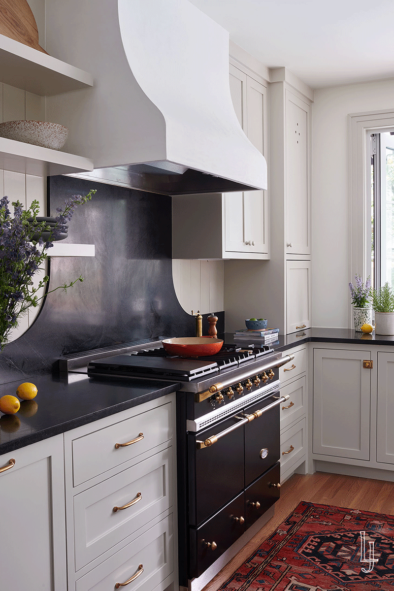
The existing dark and closed-off kitchen was far from inviting, so they doubled its size by combining the original space with the adjacent mudroom. “We have always had old houses that were very compartmentalized, so it made the biggest difference to open up the kitchen,” says Fogelgren. To balance the newness, they found inspiration in English farmhouses. “We designed it with materials that will age with the home so it feels like it could have been here all along,” says Jenkins.
A closet turned butler’s pantry, painted Farrow & Ball’s Inchyra Blue (No. 289), brings a little drama to the otherwise light color scheme.
“I’ve always loved Italian-esque stripes, and I feel like the classic black and white really brought it together.”
Because the couple loves to host, an area for carefree mingling with plenty of seating was essential. “We spend a lot of time out here, and with the indoor-outdoor flow, we always feel connected,” says Fogelgren of the back patio, which is linked to the kitchen via bifold windows. While the covered porch and pool were existing, the bar setup is new. “It was previously just a plain wall of white siding asking for an upgrade,” she remembers, so they added an awning to break it up and soften the look. “I’ve always loved Italian-esque stripes, and I feel like the classic black and white really brought it together.”
The family of four wanted a comfortable, fuss-free area to gather. A sofa with room to sprawl out was their first purchase. “It’s become the space where we spend the most time,” says the homeowner, whose grandmother’s end table and antique coffee table tie it all together. For a laid-back dining area that is equal parts fresh and timeless, Jenkins chose high-quality, casual pieces like a Knoll Saarinen table, a Serena & Lily light fixture, and a simplified take on wishbone chairs.
Although square footage was limited, the couple was set on a king-size bed (Serena & Lily’s Webster), so they made other space-saving choices, forgoing side tables that were large enough to fit lamps in favor of smaller ones and swing-arm sconces. Art and textiles layer personality into the white room. “It’s very relaxing and gives us everything we need,” says Fogelgren.
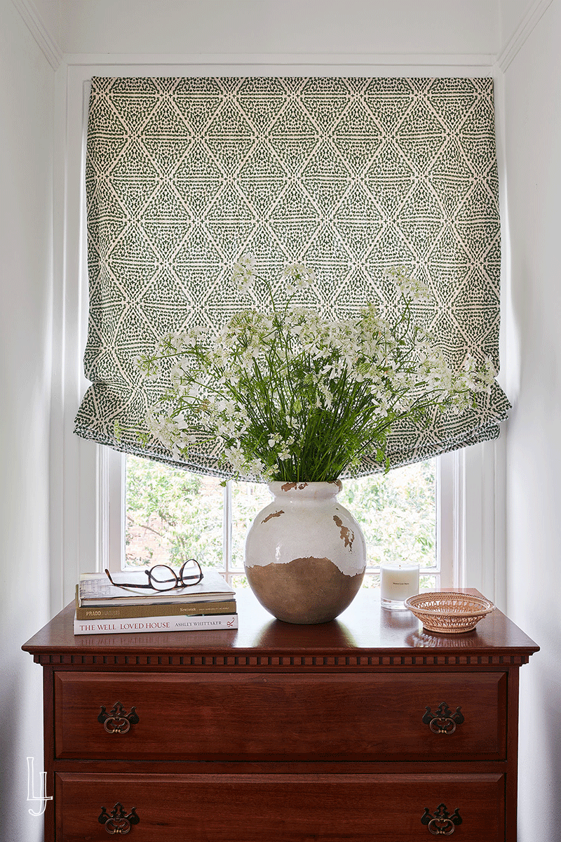
In the primary bath, the trio borrowed ideas from their Atlanta renovation, using finish selections and millwork designs by Hancock Surface Studio to turn a pint-size bath and walk-in closet into a spacious one with floor-to-ceiling cane wardrobes. To emphasize its abundant natural light, Jenkins filled the spot with tones and textures that nod to nature: Heath Ceramics Ogawa Green tile, white oak cabinets, and a linen Roman shade in Jennifer Shorto’s Oranges & Leaves. “For a contemporary take on traditional, we added a fluted-front bead detail to the cabinets, which are paired with a chunky Calacatta gold marble vanity,” she says.
“For a contemporary take on traditional, we added a fluted-front bead detail to the cabinets, which are paired with a chunky Calacatta gold marble vanity,” she says.
Designer Laura Jenkins Turns Around A Family's 1930 Lowcountry Home /
Words by Cameron Beall for Southern Living
Photography: Alison Gootee
Styling: Kate Malpeli
PROJECT DETAILS


