DURAND
1965 Classic Brick
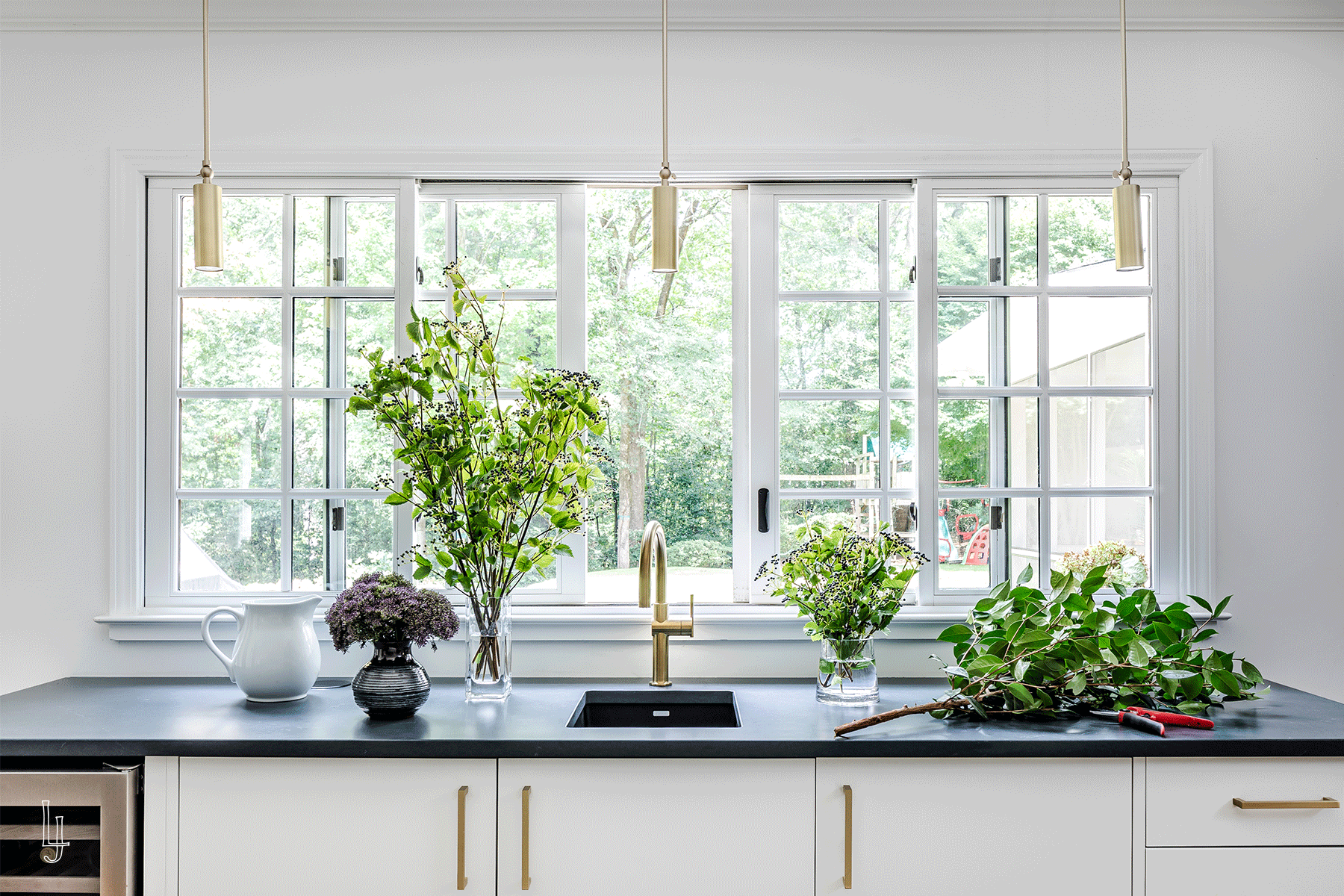
This renovation and expansion for a family of five needed hard working spaces that maximized the natural light while blending the 1960s vibe of the house with the client’s love of contemporary styling. Joyful color and pattern moments to keep it fun and are reflective the family that lives here.
a hardworking kitchen with a special wallpaper moment for everyday dining.
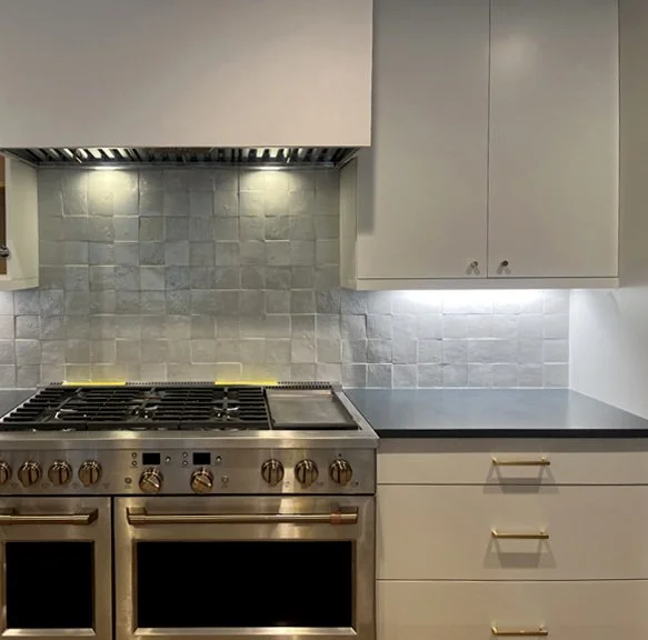
The expanded footprint of the kitchen (and primary suite above) allowed for a large island with seating and a bar that runs parallel with the windows that open to the patio. The original kitchen was dated, dark, and dreary so the clients wanted to maximize their new and improved natural lighting. Off-white contemporary cabinets are offset but imperfect zellige tile, a dark counter, brass hardware, and warm oak floors that match the original floors.
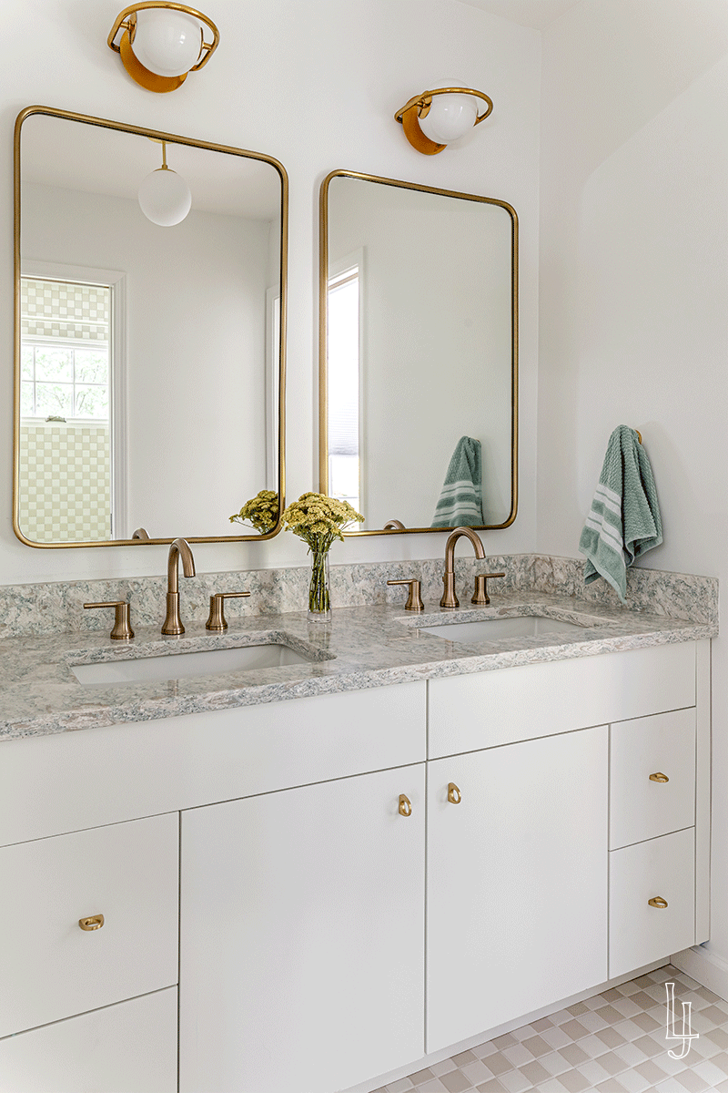
Playful yet chic with a dose of whimsy was the narrative for the secondary bathroom designs. We played with pattern versus using color for the bathrooms and the result was a design that will grow alongside the kiddos that use them.
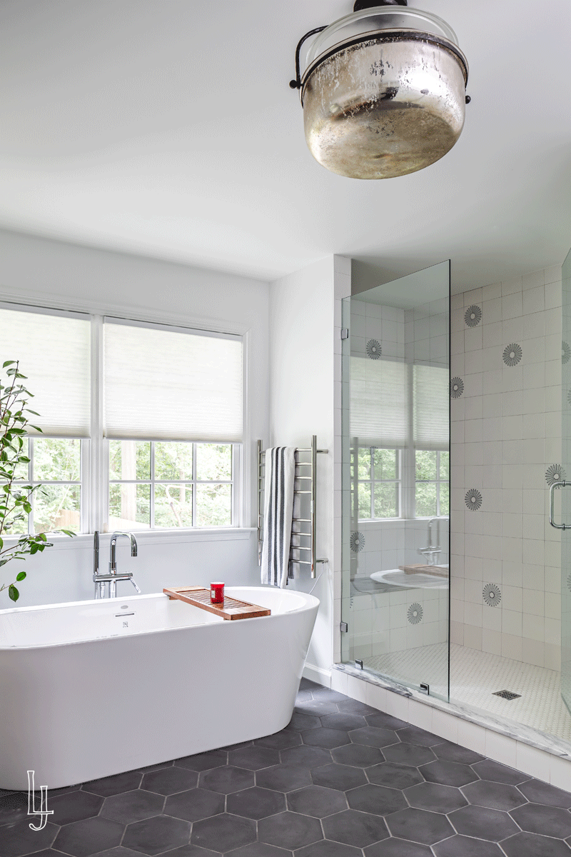
The serene and playful primary bathroom has beautiful natural light and overlooks the home’s backyard and gardens. We wanted to maximize the light and lean into our client’s preferred contemporary aesthetic. The patterned tile coordinates with the overall field tile and we placed it randomly to give the shower a little whimsy. Georgia marble on the counter and thresholds adds a nod to the home’s location while the matte black hexagon tile provides a perfect camouflage from the daily trail of foot traffic.
A moody powder room mixing a beautiful printed wallpaper, deep colors, brass, white oak, and Georgia marble. For this young family with triplets, this powder room works hard but also adds a little style to their everyday.
PROJECT DETAILS


